Why build a brand or style guide?
Brand vs Logo
First, let’s define the difference between your brand and your logo. The most straightforward way to look at your brand is to consider it your reputation. It’s everything you do and everything you stand for. That’s it. Pretty simple, right? We’ll tackle more of that another day. For this article, let’s stick to the simple definition. Your brand is your reputation.
Your logo, on the other hand, is much easier to define. In the most basic form, it is your icon and text that lets people know the name of your company and what you do. It is a critical part of your brand’s identity. It is your mark, your colors, your visual graphic identity. Got it?
Who is a brand or logo style guide for, and why do you need one?
We get this question all the time. Many companies think two things are intrinsic in their company culture; 1) that everyone who works for them knows their mission and vision, and 2) brand and style guides are for outside agencies.
This thought couldn’t be further from the truth. While most at the top often know the mission and vision, internal folks are likely a little muddy when it comes to truly understanding your brand.
We all know outside agencies need a brand and style guide to stay consistent with your company. And I can genuinely say that as an agency, we consult our client’s style guides regularly to ensure we’re on track with messaging, colors, and other identifiers.
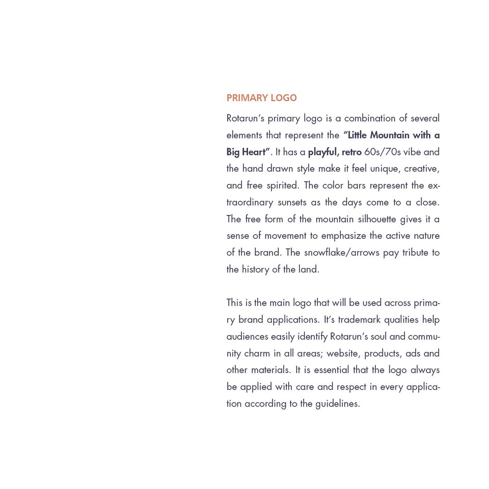
Brand and style guides are as much, if not more, intended for internal staff than for outside agencies. Often when we distribute a guide to the internal team, we see a few lightbulbs turn on in the minds of employees and even executives. Let’s take the style guide for Rotarun, for example, who knew that the skies and sunsets are epic from the mountain and that the color bars aren’t just cool stripes but have meaning and significance? Also, the snowflake has dual symbolism that pays homage to the Native American history of our area but also represents snow.
These are the kinds of things that can help staff and vendors embody the story you and your company represents. Because after all, it’s all about the story. The more you and your team can ‘feel’ your vision, the stronger your overall brand becomes.
Yes, of course, it’s about graphics too!
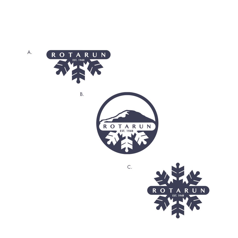
Style guides are critical for staff and agencies to get your graphic elements and colors right every time. Everyone one your team should see your logo use guide at least once, so they understand how to use your logo, and more importantly, how not to use it.
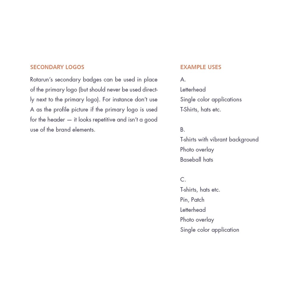
Your brand and style guide not only defines all the colors, fonts, and size standards; it also outlines how to use secondary versions of your logo.
As your company grows and changes, having a reliable style guide is critical. You can give it to your team, or an agency, and they’ll have a clear understanding of what your company stands for and how to use your graphic elements in a way that strengthens your overall brand.