How many colors are really in the rainbow?
Words by Bailey Ryan
How many colors are really in the rainbow?
When you were in kindergarten your teacher probably taught you ALL of the colors of the rainbow: red, orange, yellow, green, blue, indigo, violet… Well, I hate to be the one to break this to you but your kindergarten teacher lied to you. Believe it or not, the average human eye is able to distinguish about one million different colors. Colors can convey messages, elicit emotions and even influence moods. For this reason, the use of color is one of the most vivid and unique forms of expression. They’re used across a variety of disciplines for a plethora of reasons. Scientists assess color to determine chemical composition. Designers carefully choose colors to influence their audience. Writers use colors in expressive idioms, such as “She’s feeling blue.” or “He’s green with envy.”
It may seem a bit overwhelming to keep so many colors organized, let alone find a way to reliably systematize their potential applications; however, one company was up to the challenge: Pantone. For more than five decades, Pantone has worked consistently to establish itself as THE definitive color authority.
What Is Pantone?
Invented in the early 1960s, the Pantone Matching System (PMS) allows for creatives across countless industries to color-match specific colors. This system remained largely niche until the 2000s when it gained popularity and was introduced to the mainstream. Today it has infiltrated almost every industry, from digital work and graphic design to fashion and textile production.
In every industry, many people and many steps are involved in the creative process. Every step from the initial conception of an idea to the creation of the finished product must flow seamlessly into the next. With so many different colors and perceptions of those colors, this could easily become a logistical nightmare. For example, what one person considers “sky blue” could be considered by another to be “baby blue” or even “powder blue.” This is where Pantone comes in handy. Pantone provides a scale of color, one that is reproducible and can translate between designers, brands and producers all while maintaining color accuracy and consistency. There are thousands of Pantone colors, all of which are easily identifiable by reference number. Essentially, Pantone colors don’t get lost in translation.
What Tools Does Pantone Have?
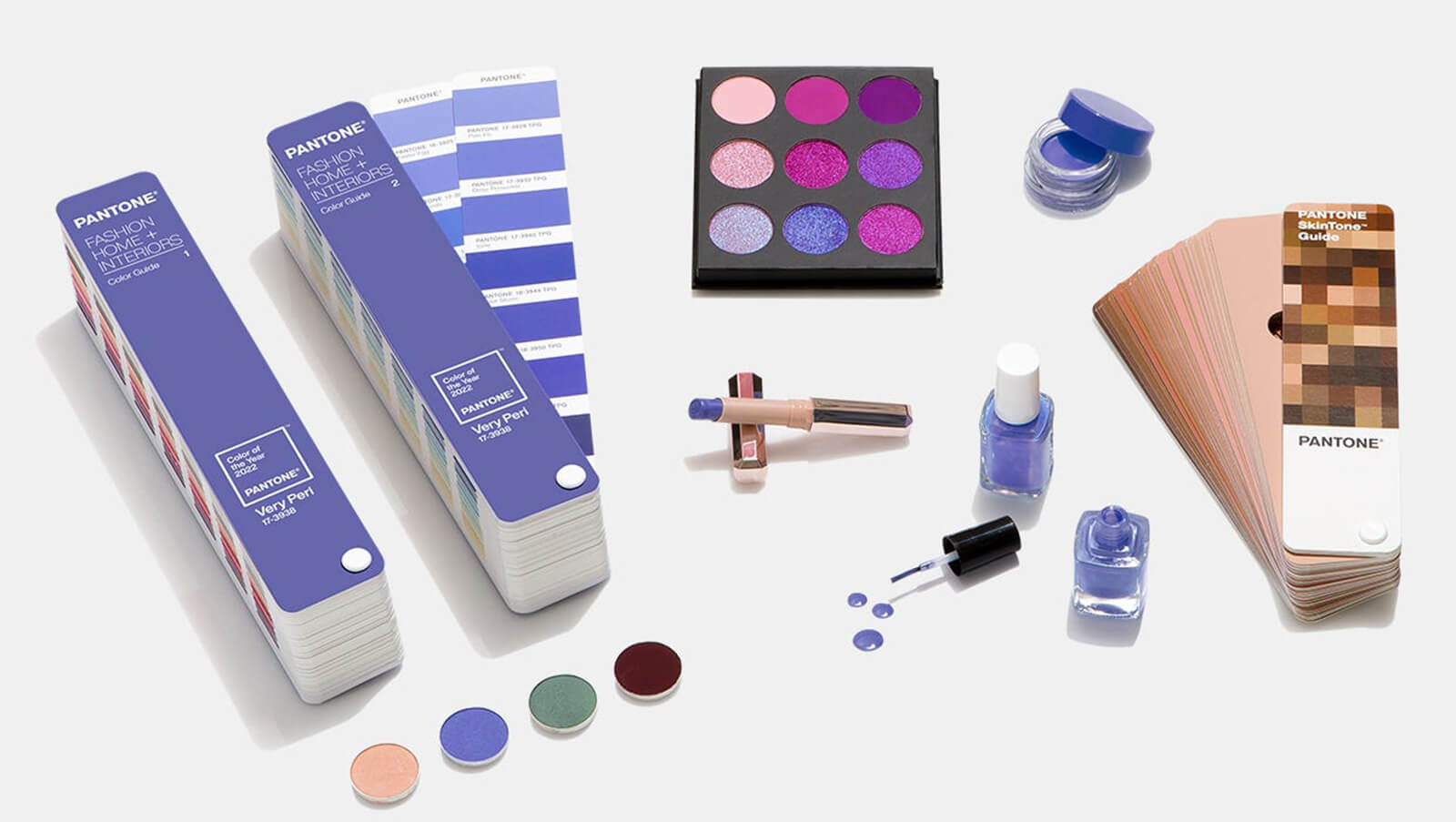
Pantone offers industry-specific color tools and a variety of color consulting services to help users choose the colors they need. Graphic and fashion design, industrial manufacturing, and more all have customized Pantone color systems and tools designed to accommodate their specific needs. Need to design a logo and website for a guinea pig massaging service? Pantone can help you choose which colors will attract the right customers. Want to choose the most trendy color for a dress that looks like a giant chicken nugget? Pantone’s color-trend analysis can help you choose the next viral color. Want to create a custom color palette from your most-liked instagram photo (that definitely has not been edited if anyone asks)? You guessed it, Pantone can do that too.
In addition to helping creatives and businesses achieve their goals, Pantone also has two easy-to-navigate apps (PANTONE Studio and Pantone Connect) for professionals and novices alike. These apps allow users to extract color palettes from photos, create their own color combinations from scratch, and even share their ideas!
What Makes Pantone So Unique?
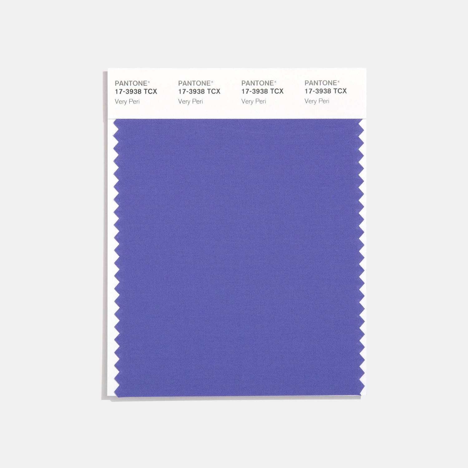
Pantone has become a trailblazer, permeating its way into mainstream culture and becoming an inspiration to many creatives. Their unique approach has allowed them to truly understand the psychology behind colors and be able to predict which colors will be popular and why. Nowhere is this more evident than Pantone’s selection for “Color of the Year.” For the first time in its history, Pantone has created a brand new color to take the title: “PANTONE 17-3938 Very Peri.” Very Peri is meant to convey feelings of joy as well as inspire creativity.
The color draws its inspiration from the rapid innovation and transformation that has taken place in recent years and is set to continue through 2022. Very Peri will significantly influence product development and design, it will be seen everywhere and, with any luck, bring a lot of joy with it!
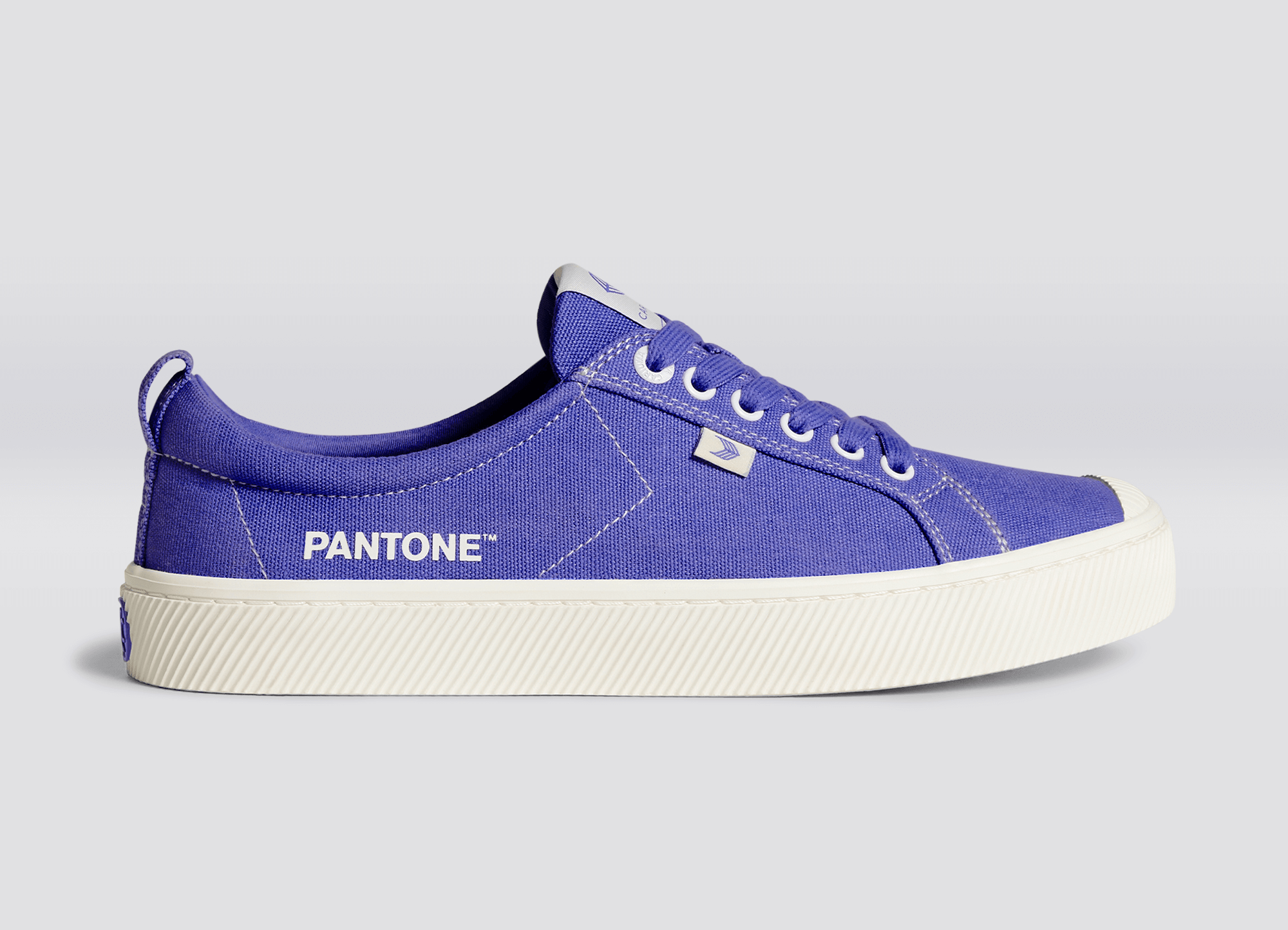
Fashion designers and Pantone enthusiasts everywhere. YES, we actually own this pair of Very Peri Cariuma shoes
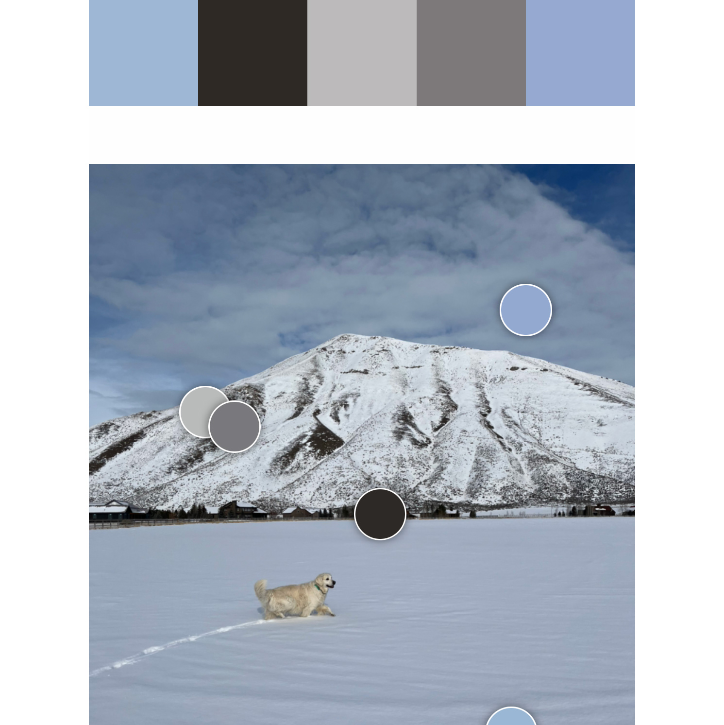
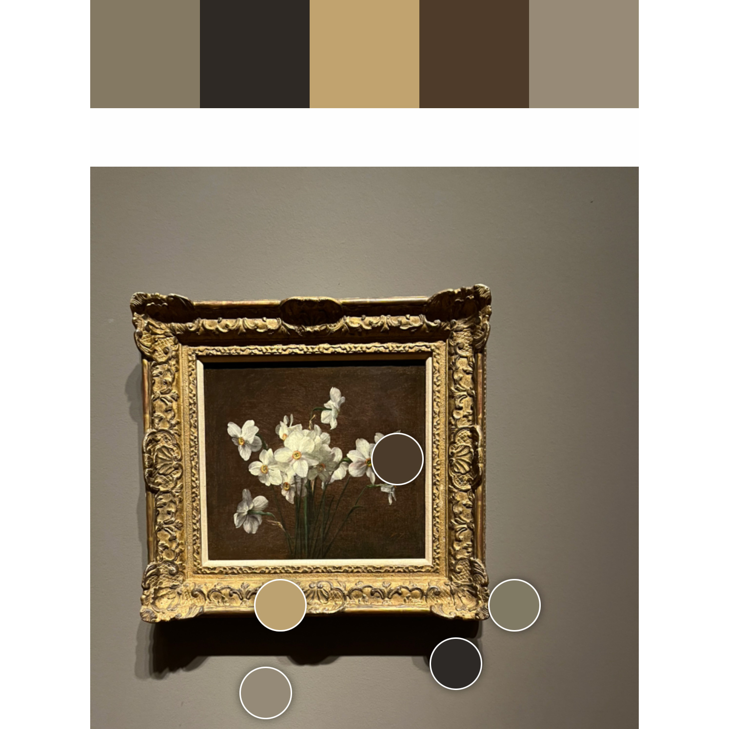
Turn your photos into the perfect color pallet for any project.
For the first time in its history, Pantone has created a brand new color to take the title of 2022’s “Color of the Year.” Way to blaze the trail AGAIN.